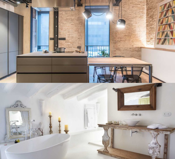
Decorating is one of the most exciting parts of moving into a new studio apartment. Since designing is highly personal, you can do whatever you want. However, having too much decoration may make your living space seem crowded and unmanaged. Even if you’re a minimalist or an eccentric, choosing the excellent compromise is essential not just for establishing a visually engaging space but also for making your house functional in your daily life.
It’s easy to get carried away as you decorate your apartment, and it can be challenging to know when to stop. Nevertheless, you don’t have to worry because you’ll learn a few simple steps to have such an eye-catching residence here.
- Having too much clutter

An owner’s refusal to part with objects that quickly become clutter is often an obvious sign of an over-decorated environment. This ends up making your apartment look smaller than it is with all the things that are scattered around your space.
Fix: Edit
When deciding on furniture, seek something that is both appealing and useful. A stool, for example, is handy while getting ready. It may, however, provide aesthetic value to the space as a whole. When determining what goes on the walls, you have to be ruthless.
- There’s no clear direction
If an area is overly decorated, it could be compared to one with layers upon layers of decoration that can become disturbing to the eye.
Fix: Take inventory
Examine the space more attentively, and don’t be scared to leave particular walls and floor areas blank. Keeping certain walls free of artwork helps you observe your interior’s design and focal points. If you take a step back to appreciate, be sure your aesthetic direction is evident.
For decorating, the Rule of Three means objects look better in a group of three. The easiest way to follow the Rule of Three is to display a matching set of décor—three different sizes of the same type of object.
The Rule of Three for Styling Your Coffee Table
- Combining completely incompatible styles
Blending styles is a risky move that must be approached cautiously. If you combine two types that do not complement one another, such as art deco and minimalism, you will end up with a house where objects stand out like thorns. This house, for example, combines rustic and Scandinavian elements unusually. The end product is less than appetizing.
Fix: When you blend styles, there has to be a technique
Begin by asking the pertinent questions: Are the styles you’re attempting to match fundamentally complementary? Is this merely a fad, or does it have any significance for me? What is the point of convergence for these two styles?
You can only mix them naturally after you’ve made sure that fundamental assumption is satisfied.. (It might be a color, a finish, or a substance, but identify it.) However, when blending styles, it is always best to seek the advice of a professional designer.
One of the simplest ways to combine different styles is to choose a traditional theme and enhance it with a modern tone. A good way to marry different decorative styles in your home is placing traditional style furniture and combining them with colors that denote modernity and contemporaneity.
How to combine different interior styles
- You’ve given it too much thought
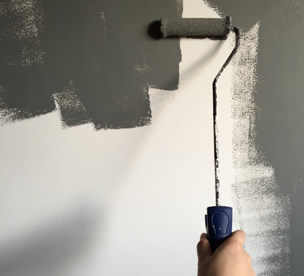
You don’t have to hang a bunch of stuff on the walls, since they can be completed with just a coat or two of paint.
Fix: Opt for paint
Instead of buying artwork or framing those images, go to the paint shop and choose a distinctive hue.
- Too many prints or too much of a single color
Too much of something detracts from the appearance and feel of a minimalist home design. The guidelines regarding prints, patterns, colors, and materials varied somewhat. But keep in mind that design consistency is more about applying bits and pieces of the same design feature across the home rather than employing an overdose of the same item inside a room.
Fix: Prints must be complementary but not identical
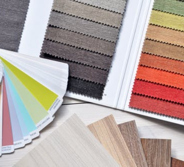
Combine prints that are not just distinct but also complementing. Therefore, pick one dominating color and base your color scheme on that. If you choose blue, you may use one bright splash of color and then follow it up with milder colors throughout the space. Having anything in the same color scheme makes your décor seem bland. Aim for a layered appearance. You may choose a single material, such as wood, but be sure to break it up with soft furniture or multiple types/colors of wood.
- If you need to look for free space, there are no obvious breaks
A visual break is just a break from the repetition of the design. Because every inch of your room has been ‘decorated’, you’ll be looking for space like you’re searching for oxygen.
Fix: The blank space surrounding the framed photos draws attention to them
Let your design and house breathe. Visual breaks include empty corners, clear floor space, and even doors and windows. Space, like furniture, is an essential aspect of your décor. While visualizing a basic room design, use open space as a design element just like everything else. This will assist you in achieving a suitable balance of décor and visual breaks.
Space can be used to both separate and connect elements in a design. Wider spaces separate elements from each other and narrower spaces connect elements to reveal relationships between them. Overlapping elements maximizes their relationship.
How To Use Space In Design
- Overflowing shelves
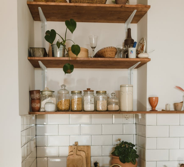
Another feature of the house is shelves overflowing with books in every room.
Fix: Treasures should be rotated
Whether it was a piece of art a friend gave us or a little figurine we found on vacation, our first reaction was to showcase emotional artifacts. But because you carried a big bag doesn’t mean you can’t put stuff aside till you had a chance. Please keep it in a convenient location to readily bring it out when you want to mix things up.
- Using too many pillows
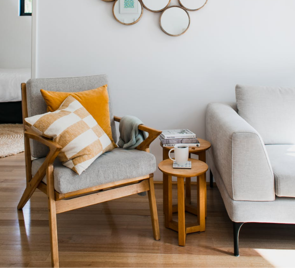
Pillows are lovely decorative additions but don’t use any that you have to move them all off the couch, chair, or bed to sit or lie down.
Fix: Minimize putting pillows on the couch
When it comes to home decor, the same rationale applies. You’ve likely gone too far because you can’t speak and see your guests since the centerpiece is obstructing your view or if there’s no place for anybody else to sit on the couch. After all, there are too many cushions.
- Purchasing the complete furniture set
Even though sourcing individual pieces can be time-consuming and take some energy or effort, it is worth it to get unique pieces because your furnishings will end up most likely being higher quality and lower cost.
Fix: Take on a DIY
It’s tempting to stroll into the store and purchase the complete living room display once you’re moving to your next real house. However, your one-and-done attitude will wind up costing you more than you think. Save yourself the stress of replacing everything within years by purchasing a few crucial items from an antiquities store. Then let your imagination go wild. A paintbrush or a stylish cloth may do a lot.

- Personality is being sacrificed for the sake of trends
A trend, when defined with regards to fashion, refers to the styling, colors, materials, and shapes that are popular in a particular season and that might have a long-term influence on the market. Interior design is like fashion because it’s inspired by culture and current events.
Top Interior Design Trends You Should Follow in 2022
Top Interior Design Trends You Should Follow in 2022
Fix: Accept both the old and the new
Allow your unique style to guide your purchases, rather than whether or not anything is trendy. Don’t buy anything from the same store to prevent falling into this trap.
Wanna learn more about minimalist decorations for your studio apartment? Read it here!


